el pollo pepe
Admin

Number of posts : 231
Age : 44
Registration date : 2008-03-26
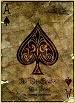
 |  Subject: for cleric Sat May 24, 2008 6:58 pm Subject: for cleric Sat May 24, 2008 6:58 pm | |
| here it is  | |
|
Enzo

Number of posts : 79
Registration date : 2008-04-05
| | Subject: Re: for cleric Sat May 24, 2008 7:11 pm | |
| | |
|
Enzo
Number of posts : 79
Registration date : 2008-04-05
| | Subject: Re: for cleric Sat May 24, 2008 7:36 pm | |
| | |
|
Enzo
Number of posts : 79
Registration date : 2008-04-05
| | Subject: Re: for cleric Sat May 24, 2008 7:41 pm | |
| | |
|
el pollo pepe
Admin
Number of posts : 231
Age : 44
Registration date : 2008-03-26
| | Subject: Re: for cleric Sun May 25, 2008 12:30 pm | |
| cleric, I think if you made the banner smaller, used smaller letters without the blue letter background, just black letters, and used smaller spades that it would look a lot sharper. Cause when I look at the banner the lettering looks blurry due to the blue letters behind the black acex pro letters, just keep the black.  | |
|